The Bar Graph provides a visual representation of statistics. It is a good way to compare relative quantities and sales. It can report counts and dollars for selected periods of time on selected statistical items. You can print up to seven statistical items for seven periods of time. (For more information, see the Setting Up a New Bar Graph Format article.) You can also use it to communicate effectively with employees and others about your business.
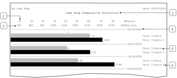
The sample report is one example of a report format. It shows the total ticket count and total sales revenue for the same weekday, four weeks in a row. You can compare the light gray bars to see the relative numbers of tickets on the four days. The dark gray bars show the relative sales revenue. The actual value is printed next to each bar as well. This sample report shows that business on 9/30/2003 was higher than that weekday for the three previous weeks.
Use the following steps to request a Bar Graph:

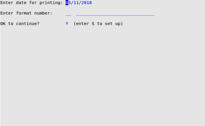
Enter date for printing
Date (MM/DD/YYYY) for which you want to print information (defaults to the current date).
Enter format number
Number of the bar graph format you want to print. The description is displayed to the right of the number. The formats available are the formats you set up. Type a new format number to create a new report. You can create up to 99 formats.
A Bar Graph makes it easy to compare numbers. Whenever you want a visual aid to help identify a trend or communicate an idea, you can create a specific Bar Graph. Once the format is saved, it is available whenever you want to use it.
On a Bar Graph, you can print up to seven items for the same time period. For example, you could compare net sales to full services on the same day. Another useful graph might compare traffic for seven hours in the same day. The report then allows you to select up to seven different date ranges. All the items you choose print for all of the date ranges you select.
This allows a lot of possibilities. If you select seven items and seven date ranges, you receive 49 bars. The best graphs to read have fewer than 20 bars. To compare a lot of information, you may want to create more than one bar graph.
You can set up each bar to represent counts, units, or dollars. Counts and units indicate how many of an item or services were sold. Dollars indicate the sales revenue. You can look at the same item in more than one way. For example, you could select net sales counts and net sales dollars to be two of the seven bars.
There are two major ways you might choose to look at statistics. The first is to compare statistics all in the same time period. To do this, choose up to seven statistics to print, and enter one time period. This report will be easy to read because it will have seven bars at most.
The second way is to compare statistics over different time periods. It is best to have each time period be the same number of days. This way, you can make a direct comparison of the length of the bars.
To create a report format, you need to identify the sequence numbers of the items you want. To do this, you can print a Statistics Sequence List (1-7-5-8). Follow the steps in the Setting Up Statistics Sequences article for setting up sequences.
Consider the following tips as you create a new report.
| Note: | Use 1 to indicate yesterday, which is the latest day available for this report. |

| Callout | Item | Description |
|---|---|---|
| 1 | Title | Report title entered in the Title field on the setup screen. |
| 2 | Counts | Count scale. Use this scale if you are reading a bar that represents counts or units. The maximum is determined by the Maximum Count Value field on the setup screen. |
| 3 | Dollars | Dollar scale. Use this scale if you are reading a bar that represents dollars. The maximum is determined by the Maximum Dollar Value field on the setup screen. |
| 4 | Date | Date or date range for each group of bars. These are set up in the Days Prior to Printing fields on the setup screen. |
| 5 | Statistics Item | Statistics item the first bar represents. Total Tickets is an example of an item expressed in counts. The actual count is shown next to the bar. For this bar the count is 70. You can see that the bar ends at 70 on the Counts scale. |
| 6 | Statistics Item | Statistics item the second bar represents. Total Tickets $ is expressed in dollars. The actual dollar amount is shown next to the bar. For this bar the dollar amount is $2450. You can see that the bar ends at $2450 on the Dollars scale. |
This report is a good way to visually represent an aspect of your business performance. You can use it to help yourself look at statistics in a new way. You can also use it to communicate with others. For example, a graph showing sales of commission items might help encourage employees to work towards performance goals.
Setting up a report takes some time. However, once the formats are defined, using the report is easy. You should keep track of the formats you have set up. Keep a sample of each format in the back of this manual. Record the format number on the report. This way, you can easily find the format the next time you want the report.